Monday, December 7, 2009

Fish and Ships! MMm mmm Gooood...

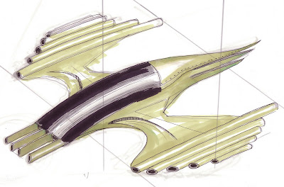
So here are a few ships I didn't post yesterday because it was getting late. They definitely need more exploration, but it gives you an idea of what we're looking for. I'm posting the Post-It note sketch first, then the more finished version.
Hopefully these lead to newer more amazing ideas soon!!
I thought this looked cool until I realized what it looked like...a mustard container.
This was alright...a little boring though.
I've been told this looks like an organ fighter!

So even though all these make me reminisce about ridiculous things..I'm going keep plugging along and see what else I can come up with. I think my favourite so far has to be the droid I completed (in my last blog).

Sunday, December 6, 2009

Doug Chiang experimentation!

So! Doug Chiang... yeah I picked up his book called Mechanika at Chapters the other day, practiced a few of his works, then tried to come up with my own with the book by my side. I was surprised with what I did come up with. I've gotta be honest that I'm not mechanically minded at all, in fact I loathed the very idea of trying to come up with spaceship designs. I was even asking Dan WHY ARE YOU INTERESTED IN THIS STUFF!!? I've always found it too hard to come up with anything that looked good enough.

Just today I proved myself wrong.

Doug Chiang's book on drawing mechanical beings and spaceships really forced me to look on the fun side of all this. He uses a simple yet striking technique that makes the whole process of concept to finished art fun as hell. My concepts are not exactly where I want them to be yet, but I was very happy that I could draw something that looked good.


So the steps for getting from a small concept to totally awesome art according to Chiang (and I decided to change it up a bit too!):

1. Try to draw your earliest concepts on post-it notes. This seems silly but really works. Even when I try to just draw small images on a large piece of paper, I feel inclined to draw those tiny concepts bigger and bigger and BIGGER for some reason. Try the post-it note thing because with what Chiang explained in the book, it forces you to think in the main shapes rather than the details.

2. When you've come up with something you like, switch to a bigger, but not your final, piece of paper. Start with your blue pencil as it's more forgiving when you're experimenting with shapes. You are NOT focusing on the details yet, you're still focusing on the large shapes, but you're further exploring what can be done with the shapes. Try to "eye" what feels best as far as proportions go.

3. Now that you have a sturdy concept, switch to your final paper. Try to find/use the tools he lists, I've experimented with a different brand of marker because I happened to have them kicking around from first year graphic design. I'm using a very light (20 or 30 percent) Letraset cool grey for the base guidelines which will become part of the final drawing.

4. Use a darker tone of grey to start finalizing the guide drawing and to work in some more guides for the finicky detailed shapes. I found the more you use and experiment with your grey markers, the more thought out and amazing the final piece will look!

5. (For the non-mechanically minded) Here is where you want to start listening to some good music. Take your .05 fine tipped Staedtler marker and start bullshi*ing final shapes based on those grey guides you drew. Again, I've got to be honest, I did have the book beside me, but it gave he a good hand in coming up with my own mechanical structures that looked like they would work in real life.

There was a lot more Chiang explained in the book that I found very interesting. He went on about using these toy model cars and other mechanical things as reference for his creations. He also explained that not finishing the drawing (like I did below) is good for letting the viewer fill in the blanks.... I'm not going to get into all of it because I'm really supposed to be talking about Dan's game.

But yeah, I had fun.

Post-it note sketches, they really work!
This guy was inspired by a Stremeline Moderne/Art Deco lamp of all things!


Final Rendering

Thursday, November 5, 2009

I'm working, yes indeed, I'm working....

This is what I needed to see. I just realized I had a sampler of this book from free comic book day. I picked it up from Carry on comics in Uptown Waterloo before leaving to go to Newfoundland last year. Doug Chiang explains how to build a concept from blue line scribbles to a fully refined piece of artwork. All I need is...(PENCILLL ALLLERT!!)

-my blue line pencil
-30, 40, 50 60% cool grey Pantone Letraset marker
-triangle
-any scrap paper
-fine tip black marker
-Colour printing paper (for the more finished artwork)

I'm now going to take what I've created in my scribbling stage and apply it to Doug Chiang's way of refining a concept! See you soon!!


Wednesday, November 4, 2009

Menacing faces!!

Trains, especially streamline trains, were scary looking, I'm not talking about Thomas the Tank Engine faces either!!! Have you ever looked at the back bumper of a car and said to yourself, "Hey! That car looks really happy!" or "Hey that car looks like it's gunna kill me." or "Hey that car looks constipated.", well I'm trying to find some good mechanical "faces" for the ships in Dans game. I've been watching videos and looking in books about streamline trains and have noticed a pattern of menacing looking faces. Heres what I'm talking about but with cars.

I have a ship concept that hasn't been scanned yet, but is based on a zigzag art deco motif from a door in the Chrysler Building. It's a 2D frontal view of an eagle with ziggurat wings. Dan brought up a good point that maybe I can try turning those 2D motifs into 3D ship designs. I found an amazing walkthrough were someone uses the body shape of a Manta ray in the design of an organic spaceship. The design I'm doing won't be very organic, but this is kind of the same process I'm going through for the zigzag inspired spaceship design.

Tuesday, November 3, 2009

H1N1 was the best flu I ever had!

Everyone is freaking out about the piggy flu, but I'm contrary to all the hype. I had swine flu after Dan had it, and I've got to say it's not all that bad. It lasted me a total of ONE day. I thought the symptoms were gonna be back after the tiny attack and they never came.

Every other flu I had was waaaaaay worse.


So I've been too busy for words at work, trying to find the time to do a bit of sketching is tough, but I got ON it today. I've come up with some conceptual work for Loop Clothing, nothing really stands out too much yet though. I renewed the books I borrowed from the library for Dans game. A lot of the Art Deco motif hunting is finished. Dan would like me to get on with the more refined stuff asap. There will need to be a logo for the game coming soon (not to mention a name)...

I'm allowed cry about one thing though... WE NEED A FREAKING SCANNER! As soon as we get one installed I'll be able to show off a lot more than what I have so far. I think I'm going to go hunting for one this week, I hope you don't mind Dan.

Here's a hedgehog I'm working on for sh*ts and giggles.


He's based on this one I found on the interwebs, I thought it was too adorable to pass and not make a character of. I think he'll make a good strong sticker.


Wednesday, October 28, 2009

Sickness SUCKS!

I apologize for those of you who were expecting to see some new art/sketches. Dan most likely has H1N1, and I may be coming down with something. I'm hoping not though...
I'll try to get back to posting soon!

Monday, October 26, 2009

Birthday Tea Monkey!

I made myself a Tea Monkey for a mini interview at Loop Clothing in Waterloo! I'm hoping to do some freelance illustration for Loop Clothing because their merchandise has (in my mind) the same vibes as my illustration.


I wish the picture size was just a bit bigger than this but whatev. I'll decide on colors a little later today, but for now the black plate is done.

This has been a good little break from all the Art Deco stuff!

Friday, October 23, 2009

I'm getting sick of saying Deco.

So I watched this video on youtube about Art Deco and apparently there were different periods in Art Deco.

ZigZag Deco 1925-1929: Everything had this zigzagy, geometric look to it.

Streamline Moderne 1930-1939: Everything looked like it was going fast. This is what Dan and I are interested in... nice to know the real name of this period.

These are different types found in a few areas:

Tropical Deco: Used a lot in Miami Florida, everything looks colorful, Deco Style.

New York Deco: Focusing mainly on the skyscrapers. Using the ziggurat pattern creates the illusion of space, tallness, and sleekness.

Hollywood Deco: Apparently the deco you see a lot of today. Bold dramatic lines. Mainly what hollywood was using to create their sets back in the 20's-late 50's.

There's probably more than just this.

Let's explore!

Last week I had a roaring urge to go urban exploring.

I never knew Barra Castle existed until my friend pointed some pictures of it on Facebook. I read a little about it and discovered it was built in the 1930's, there was also this huge story that it has been neglected for quite some time. Some guy bought the place for $780,000 spent another $250,000 replacing the roof, then was kicked out because the fire/electrical inspectors sought it was too dangerous and was in really bad condition... which to my mind makes no sense because the guy was trying to FIX that problem. I mean come on let the guy finish at least!!

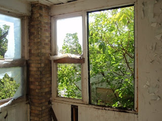
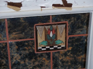
Anyway, what I was more interested in was finding some more Art Deco motifs. We took a lot of pictures, but came out with not much relating to Art Deco, even though the place was built in the 1930's. I'll post the ones I liked best, including the ones that came close if not on the dot for Art Deco. For those of you who are not caught up with the earlier blogs, I'm needing as many Art Deco motifs as I can get in aid of a video game that Dan is currently programming. These motifs will be used for creating some spaceship/fighter designs.

Here are some pictures (some taken by my friend and some taken by moi):


Neat little light cover.

One of the many many many bathrooms.

Yeah, don't know if that's black mould but stayed away anyway.


My favorite room, mostly because I could breathe

Not a big fan of the brick wall paper.

More decorations I really liked.

Wowee.


I liked these decorations on the fireplaces.


Creepiest part of the visit.

Some more boarder details.

I did not want to go down there, but guess what, we did.

Nothing like a hot steaming bath to end all your worries. Add wood to enhance the experience.

The top of that metal thing was the only motive I liked enough to add to my collection.

Amazing hallway, too tight for my liking!

A better example of one of the many fireplaces.

The glass designs caught my attention in this photo, I've seen glass like this in Deco books.

This is a good example of the water damage we found... what a stinky mess.


This is the facade of the building cracking off, believed to be one of the
issues the inspectors had.

You can't see it too well in this photo, the motifs in the boarder of this doorway.

Concrete pillar SMASHED!

Old style mailboxes, probably from the original design.

Bad example but the fireplaces in this house were the closest things I could find to Deco.

Cherub on the point of this arched doorway.


Nice lion face on the outside of the building.

I hope you enjoyed the photos...
I'll be back with some artwork that combines the deco with the fighters/spaceships.
See ya!

Monday, October 19, 2009

Deck the halls with Deco artists Fa la la la la la la la lahh!!

I've been looking more in depth with all this Deco stuff, and have found a few favorite Deco artists so far.

François Pompon - Known for his stylized animals. This guy's ability to work in extreme simplicity is stunning. My favorite piece of his has to be the Polar Bear. I really like the Hippo too! They're almost like the designer toys everyone is going crazy over today.


Pierre le Faguays - I'm not familiar enough with him to know what he's really known for, but his Faun and Nymph statue really caught my attention, very geometric stance. The wavy hair on the nymph is another Deco motif I added to my collection.

Paul Philippe - I would Imagine he's well known for his human figurines. "Dancer with Turban" was my favorite, but unfortunately couldn't find it on the net. So, here's another of his...


Gustave Miklos - I really enjoyed looking at some of GM's work for it's beauty, simplicity, and mostly, it's strange forms.


All of these guys are sculptors, so I guess that means I like the sculpture part of Art Deco, I'm going to dive further into all this and explore more forms. There's still two dimensional and architecture to explore. My goal is not to study the artists themselves, but get a really good feel for this style so I can start creating my own stuff. I've already started sketching my own artwork in this style...

more on that tomorrow!!